
Color Analysis Competition
The winner of the latest Color Analysis competition was Julie from New Zealand. Her response was inspiring and I think many of you may associate with her words!
"I am about to turn 50 in a few weeks. Ill-health and the ensuing treatment over the last few years has changed my body shape, my hair colouring (now greying) and my outlook on life! I believe life is for living and I want to embrace my future with energy and a wardrobe of colour that brings life to my appearance too!"

She's always been a little confused...
Many years ago she was determined Spring and then Soft Autumn! Confusing, even then, as she combined a career with raising a family but at least she had some idea of colors that suited her. Once both the menopause and ill health hit, she found herself with graying hair and a completely different body shape. Few of her existing clothes fitted and she had no idea what colors or intensity to choose. Furthermore, although she hoped for some color, she had inwardly accepted that soft and muted colors 'would be best'
In spite of these difficulties, Julie's positivity and 'glass half full' attitude resonated with me immediately!
I usually start with Warm v Cool
During Online Color Analysis I disregard any previous direction! From the outset it was easy to see that Julie's coloring responded to the Warm side of the spectrum.

Definitely Warm so let's look further...
She has Warm undertones which have remained even though her hair has transitioned into gray.
By comparing the three palettes which have a Warm undertone I determined that Spring colors are too harsh and the Autumn colors are far too heavy for her complexion.
The Seasons do not work for Julie but the WARM color palette (one of the Tonal Color Families) echoes the mellow but strong warmth in her natural coloring.

Julie now says:
"A huge thank you for the analysis. Over the last couple of weeks, I've been pulling out some of the brighter warm coloured clothing that has languished in the back of my closet for too long. Some of them have been happy reminders of the fun in wearing colour, others have not worked so well but with your comments and analysis in the back of my mind I can look at them with fresh eyes and figure out if it is the fit or the colour that is not working for me - and happily let some clothing items go so that a new owner can get joy from them.
The timing was also wonderful. It is coming into autumn here in New Zealand and the shops are filling up with rusty reds, greens, browns and caramels and cream colours. It's a perfect time for me to browse the shops, complete with my colour palette and to try some new colours in my wardrobe." Julie, NZ

She's not a Season she's Tonal!
A series of images take me through lots of both Tonal and Seasonal color palettes to assess and discover the perfect fit for Julie's coloring. It is the center point of the WARM spectrum where Julie's photo finds the best balance. Not with the Seasons!
The WARM Color Family is one of the pure TONAL Color Families. It has just one primary color characteristic, not a mix like the Seasons. Although the Warm palette includes some shades from both Spring and Autumn, it excludes the elements that are not needed.
The WARM color palette
Julie's natural coloring is WARM i.e. she has a yellow/golden undertone, and Color Analsis works when this characteristic is echoed in the colors she wears.
The WARM color palette has an entire spectrum of colors which blend and harmonize with each other ready to fully complement Julie's natural coloring.
You're not limited with your own color family because, just like an artist's palette, there are literally hundreds of shades between each color. The golden undertone adds a strength and yet a mellow warmth providing the contrast and clarity that Julie's coloring demands. There are both soft and strong shades within the Warm palette which allows choice according to mood and occasion.
While the classic neutrals will provide the base for wardrobe essentials, the fabulous accent colors will bring it all to life - perfect for both a business casual and leisure wardrobe.
For a lady who loves vibrant colors what could be better!
- Your most flattering colors are always those with a Warm / yellow undertone
- Choose peach, apricot, coral and salmon through to the deepest pumpkin
- You can wear yellow toned greens - lime through to moss and olive green
- Beautiful yellow toned aquas, turquoise through to deep soft teal blues
- Clear blues and the gorgeous light and deep periwinkle, also a deep warm purple
- Choose to wear rich creams and ivory next to the face rather than pure white
- Your best neutrals are camels and browns, warmer shades of navy and grey

And those to avoid
Warm colors have a golden undertone so anything on the Cool side of the Color Wheel is completely alien to Julie's natural coloring.
Blue toned pinks, fuchsia and magenta, and clear jewel tones like emerald green and blue red all have a blue Cool undertone and are far too sharp against a warm skin. It can make the complexion appear cold and pinched!
Pure white would look far too clinical, choose a soft cream.
Black is never good next to a warm complexion, so if it's ever essential that you wear it try to keep it as far from your face as possible - use a scarf or a lower neckline with pearl jewelry to bring light to the face.

How Color Analysis works online
Years ago when I worked face-to-face I would have said that was the only way. But since I've worked purely online I know that I do a far better job now than I did then.
Several reasons: I never rush so have more time for things to click around in my mind; I have everyone's natural coloring, background, heritage, viewpoints etc. in front of me to which I can keep returning; I see what's happening in images; I have more than one photo which often shows skin tone in different lights; and I can explain fully exactly what is happening via the images I produce. Moreover the client sees what's happening and is assured that it's not just me 'telling' her what I think, it's what she can see!
Seeing all the images gives us both time and opportunity to reflect on what is recorded. When you're face to face it's difficult to pin down what is seen at a particular time and to remember what has been said. The most important thing is that YOU are connected to a color palette that allows you to feel comfortable and to feel like YOU. And, remember, a color palette is never finite it's merely the beginning!
Like to see how I assessed Julie's body shape?
You might like these
Low Fat High Fibre
Moroccan Chicken, an easy, quick and fabulous winter warmer that's low fat high fibre
Remembrance Day
On Remembrance Day 11th Nov, people in the UK wear a red poppy and observe a 2 min silence at 11 am in respect and gratitude to those who gave their lives for our freedom
High Fibre Soups
High fibre soups - quick, delicious, filling, healthy, warming, good for the figure, impressive to serve and cheap to make! What's not to like!


Homepage >> Color Analysis Competition
Hi I'm Pamela - come join me!

The latest on THE BLOG!
-
Style Confidence for Women | Style Yourself Confident
Jun 01, 26 09:01 AM
 Build style confidence with practical help on color, shape, style, beauty, and wardrobe choices for women.
 -
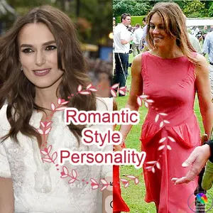
Romantic style personality for women over 50
Jun 01, 26 08:11 AM
See if a Romantic Style Personality suits you, with easy outfit ideas, soft fabrics and feminine details to wear beautifully and confidently after 50.
Like to join the Style Yourself Confident Group Board on Pinterest? Just Contact me to be added ...
By Pamela Graham Copyright 2012-2026 Style-Yourself-Confident.com
Powered by Solo Build It