
or use the SITEMAP
You have LIGHT tonal coloring
Your primary characteristic is LIGHT which means that you belong to the LIGHT Color Family
If you don't fit easily into this color palette, try the SEASONAL Color Quiz.
Everyone has a Season that's closest to their natural coloring.

- Your natural coloring is fair and delicate, almost fragile
- There is little difference between the color of your eyes, skin tone and hair, this means your contrast is LIGHT
- Your skin tone may be pink, ivory or golden but always very fair
- Your eyes will be light blue, grey, aqua, green or occasionally hazel
- Your hair is fair, blonde or very light brown
- You often stay looking younger than your years
- All the shades in this palette have the same LIGHT characteristics as your own and will harmonize with and complement your coloring and complexion
Your best colors
You will probably feel an affinity with your new Color Family or, at least, with some of the colors because your natural coloring and your instincts are connected.
Wearing these colors will allow you to look your best and avoid wasting money on clothes that don't do you justice.

Carrying colors in your head is difficult and a fabric Color Swatch makes organizing a breeze and shopping a pleasure. Your choice won't be limited, on the contrary, between each color there are literally hundreds of shades and tones just like an artist's palette.
Why you should choose to wear LIGHT colors
- Because all these colors have the same undertone as your own
- Wearing these colors echoes your own coloring creating harmony and balance
- This harmony allows your coloring to shine and you will look your best
- You can use this color palette to create a co-ordinated wardrobe
- The LIGHT color palette includes some Warm and Cool shades
- It includes just the TRUE LIGHT shades from both the Spring and Summer swatches and eliminates the elements that are not needed

- Choose pastel blue through to cornflower, lavender and orchid
- Aqua and turquoise, and soft blue greens
- Pastel pink through to a Deep rose, alongside peach and apricot
- Even a beautiful and light Watermelon red
- None of these colors are light and wishy-washy; they just have a LIGHT intensity i.e. a lighter pigment which makes them delicate enough not to overpower your natural coloring

Neutrals
- Neutrals form the backbone of your wardrobe - the investment
pieces such as coats jackets, trousers etc. which take you from season
to season
- These colors are great for accessories too
- Neutrals create the perfect foil for your strong accent colors
- Your best neutrals are all LIGHT, stone, taupe and pewter, lighter navy and lighter grays, even a light olive green can look good
- These neutrals may look light against stronger neutrals but they are heavy enough to add gravitas to your coloring
How to wear your LIGHT colors
It's difficult to visualize how an outfit should look. But your primary consideration is LIGHT whether it is Warm or Cool. You can wear and enjoy all the colors in the WARM color palette.
If your coloring is quite bright towards some of the shades from the Spring palette.

If your coloring is softer then you may prefer the softer and duskier shades of Summer. But you are able to wear and enjoy both.

LIGHT shades from the Summer palette at Kettlewell Colours
Makeup, hair and jewelry
All makeup will look deeper on you than on any one else because your coloring is so fair. It is better to avoid deep colors.

- Your
hair is blonde, fair or very light brown. If you feel a little
colorless or childhood blonde has faded, you can add gentle blonde
highlights for brightness.
- Avoid an overall heavy blonde tone which may overpower your fair skin.
- Silver tones are often more delicate for a Light complexion, platinum or white gold - even a mix of silver and gold
- You can of course wear gold but aim to avoid anything bright or garish
- Light creamy pearls are particularly flattering and bring light to a fair complexion

LIGHT Color Brief £4
The LIGHT Color Brief is ready to download and print out with all the concise information you need to start wearing and enjoying the LIGHT Color Family.
With 45 colors, advice for makeup, hair, jewelry and glasses frames. It also comes with a printable color swatch so you can make it up into an mirror image of the fabric swatch.
This is a digital product.
The TONAL Color Brief £16
(6 books and 6 color swatches for the price of 4)
A FULLY ILLUSTRATED digital book clearly explaining Tonal Color Analysis. How to identify your primary color characteristic and translate it into a complementary group of colors i.e. your most obvious Color Family.
A 60 page book with detailed information for each Tonal Color Family. You can even print out, make up and laminate your own color swatch.
It explains how your natural coloring works and how you are linked to a particular Color Family; how to wear and enjoy your best colors, How to recognize your neutrals and accent shades; it shows you how to choose your best makeup colors, hair shades and even how to select jewelry to flatter you.
This book is a digital download

Select LIGHT in the drop-down menu
UK
Select your Color Family in the drop-down menu
P and p is £3.35
EUROPE
Select your Color Family in the drop-down menu
Postage and packing for Tracked safety is £9.95
REST OF WORLD
Select your Color Family in the drop-down menu
Postage and packing for Tracked safety is £11.45
Click here for an indepth personal Color Analysis?
You might like these
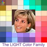
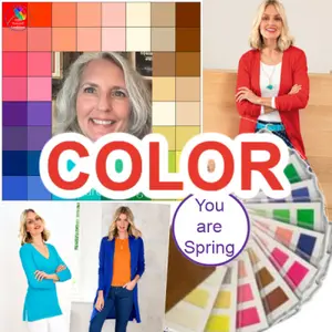
Color analysis Light
Color Analysis Light - your natural coloring is predominantly Light and you can wear and enjoy the lightest colors from Spring and Summer
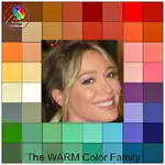
Color analysis Warm
Color Analysis Warm! a natural golden coloring is enhanced by colors with a yellow undertone, you can wear and enjoy many colors from both Spring and Autumn
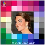
Color analysis Cool
Color Analysis Cool, your natural 'English rose' pink complexion will be enhanced by all colors with a blue undertone and you can happily wear and enjoy many of the colors from Summer and Winter
Homepage >> Color Analysis >> Free Color Analysis >> Light tonal coloring
Hi I'm Pamela - come join me!

The latest on THE BLOG!
-
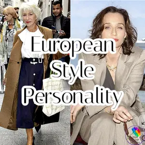
European Style Personality - City Chic Style!
Apr 22, 26 12:40 PM
 Learn how a European style personality uses quality fabrics, sleek cuts, and neutral tones to create polished, graceful looks that work beautifully at any age.
 -
Style Confidence for Women | Style Yourself Confident
Apr 19, 26 08:23 AM
Build style confidence with practical help on color, shape, style, beauty, and wardrobe choices for women.
Like to join the Style Yourself Confident Group Board on Pinterest? Just Contact me to be added ...
By Pamela Graham Copyright 2012-2026 Style-Yourself-Confident.com
Powered by Solo Build It